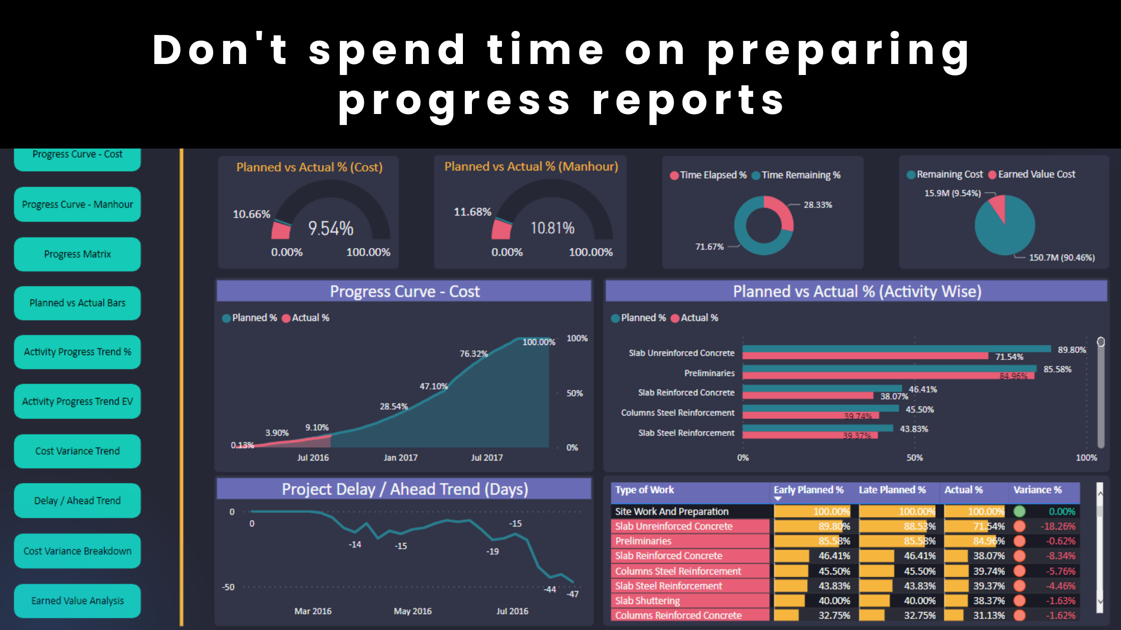
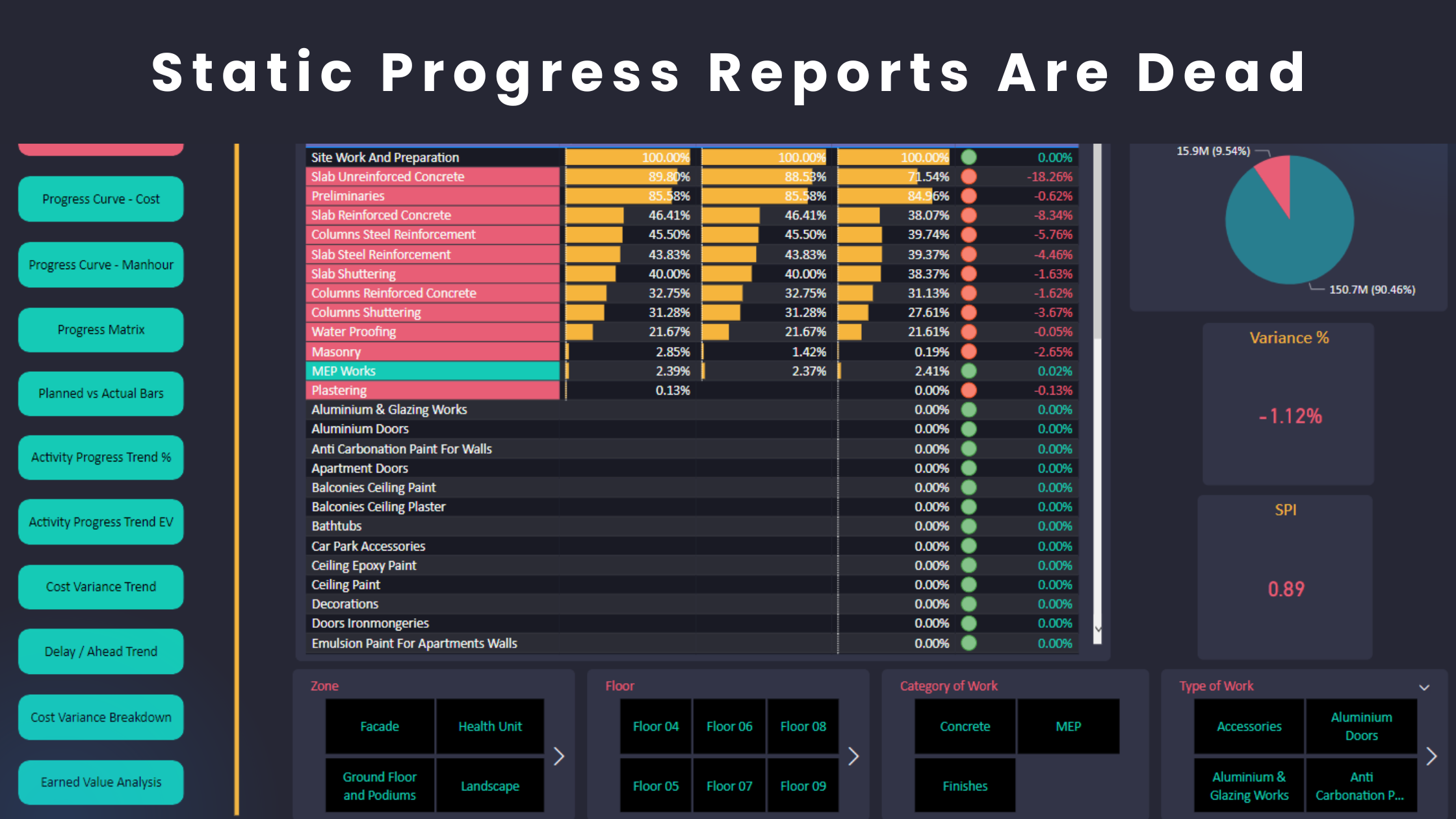
When it comes to project control, presenting your data with clarity and consistency is essential. Power BI is a powerful tool, but its true potential shines when your reports are formatted for maximum impact and usability.
Here are my top 11 formatting tips to create polished, professional Power BI reports:
1. Use a Theme
Consistency starts with a theme. Apply a Power BI theme (.json file) across your reports to ensure uniform colours, fonts, and visual styles. This not only saves time but also maintains a cohesive design.
2. Align Visuals
Alignment matters. Use the gridlines feature to align your visuals and ensure a clean and professional layout that’s easy to navigate.
3. Stick to a Colour Palette
Choose a complementary colour palette. For example, if red is your main colour, search for “Red Colour Palette” online to find colours that pair well. This helps avoid clashing tones and ensures a professional design.
4. Maintain Consistent Design
Establish a design standard. For example:
- If your chart titles have a violet background with white text, apply this style to all charts.
- Ensure charts of the same type have identical dimensions for a symmetrical look.
5. Avoid Overlapping Visuals
Spacing is key. Crowded visuals create confusion, so always leave enough room between visuals to enhance readability.
6. Clear Labels
Clarity over complexity. Rename fields in each visual to make their purpose clear. Avoid cryptic labels like “Planned%”—instead, use “Planned Progress (%)” for better understanding.
7. Disable Redundant Titles
Less is more. Turn off titles for visuals when the layout already makes their purpose obvious (e.g., data in cards).
8. Keep Interactivity Intuitive
Choose slicer styles that match the context:
- Use a slider slicer for analyzing progress curves.
- Use a dropdown slicer to store data dates.
This approach ensures the report feels intuitive and easy to navigate.
9. Data Formatting
Standardize your formats:
- Use thousand separators for costs and labor units.
- Add currency symbols for costs related fields.
- Maintain consistent decimal places for metrics like SPI or % Complete.
- Use the same date format (e.g., DD/MM/YYYY or MM/DD/YYYY) across all visuals.
10. Navigation Buttons
These buttons are highly recommend and I’ve been using them for a long time now. Add buttons for seamless transitions between report sections. These not only improve usability but also give your report a professional look.
11. Have a Checklist
I am a big fan of checklists. Before finalizing the model, go through your checklist to ensure formatting consistency. This habit will save you time and improve the quality of your reports.
Why Formatting Matters
Well-formatted Power BI reports:
- Make insights more accessible, actionable and understood.
- Enhance communication with the site team, consultant and client.
- Showcase your professionalism and attention to detail.
By applying these tips, you’ll create reports that stand out and drive better decision-making in project control.
Regards,
Osama Saad, MBA, PMP, PSP, CCP, PMI-SP
Learn More!


