Here is one story that planning engineers are familiar with. You decided to identify the progress issues and determine the root cause of the delay. You start to do the following in an effort to pursue this dream.
- Open the XER file and add any relevant columns to your layout.
- Apply P6 filters
- Copy data into Excel, apply formulas and continue the analysis further.
- Prepare a variance report for all project areas.
- Determine the areas that require your attention.
- Refine and prioritize your selections based on certain metrics (e.g. cost, manhours, etc).
- Open the Baseline XER file to extract any necessary data (e.g. planned weekly cost or manhours for specific project areas).
- Make sure that the excel formulas are properly configured in the different sections of the report.
- Format the report.
- You receive feedback from your management.
- Repeat many tasks to incorporate this feedback.
Before you know it, your dream of performing an effective progress analysis has turned into a nightmare.
Don’t blame your systems or your management because the human brain doesn’t know what it is looking for until it sees “triggers”.
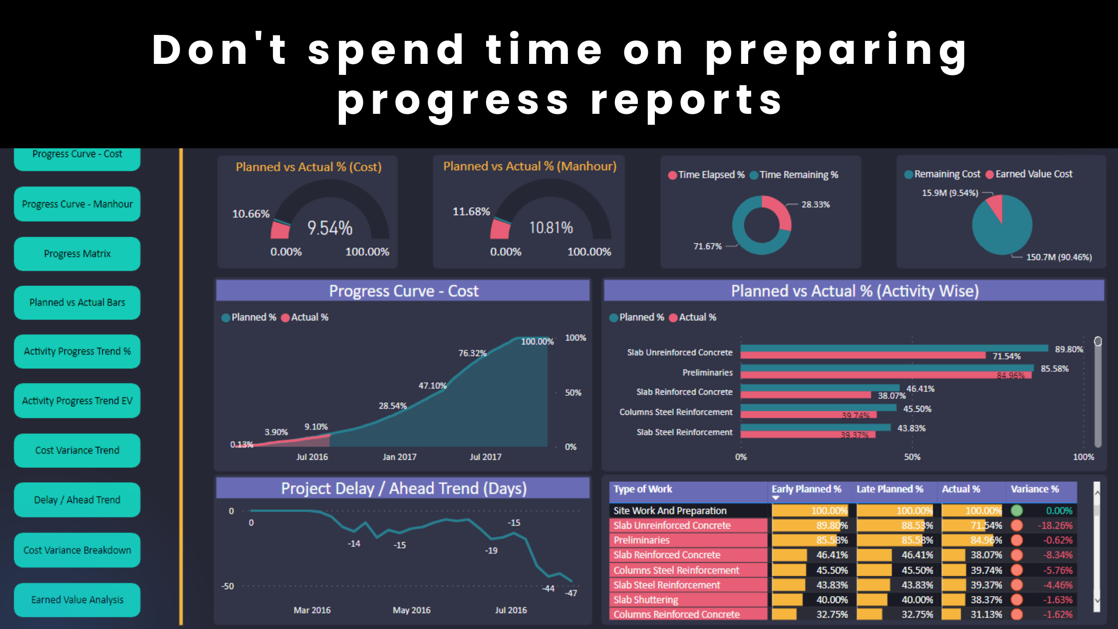
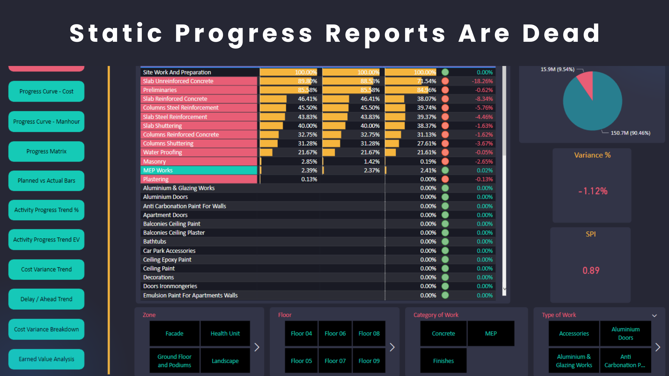
You prepare a report that shows an overall variance of -5%. As the project is in delay, you are motivated to investigate further. After some analysis, you found that concrete is the dominant cause of delay in the project. You analyzed further and determined that the formwork activities take longer than planned. However, you wouldn’t have looked at the formwork activities if you didn’t see a “trigger” in the concrete activities. Similarly, you decided to analyze the concrete performance when you saw a “trigger” related to the overall project delays.


An interactive report or dashboard allows you to review the progress status and act on “triggers” with a click of a button and within seconds. It is not really a science. The idea is to find a way to code the process of performing the above 11 steps that I mentioned. Although the steps may vary but you got the idea. You basically set up a report template, present your indicators and create your charts. You also develop systems that use technology leverage to perform certain steps or loops and add them to your workflow.
This will allow any planning engineers to dig deeper and analyze any area in the project quickly and effectively. Planning Engineers can then deal with “triggers” in a better way because they can perform their analysis, recall information and receive feedback from the system instantly. This is only possible if the analysis is performed in a dynamic way using technology leverage, not humans.
That’s why interactive dashboards are so important because it gives planning engineers the flexibility, motion and freedom to explore analysis opportunities that aren’t possible to get with the traditional static reports.
Static reports might present the triggers but don’t help you a lot in the next step.
Moreover, interactive dashboards are not popular among planning engineers. If you can create interactive dashboards for your projects, you will impress all stakeholders, help your company save money and unlock better career opportunities.
Power BI allows you to create interactive reports and dashboards in a seamless way. The software is also free for the most part.
Regards,
Osama Saad, MBA, PMP, PSP, PMI-SP


