There is no standard format for progress dashboards. Some planning Engineers make the mistake of showing unnecessary content in the dashboard while others miss important progress data. This article will explain the followings about dashboards.
- What is a progress dashboard?
- The story framework of a progress dashboard.
- Dashboard Presentation.
- Automation
- Level of Details
What is a progress dashboard?
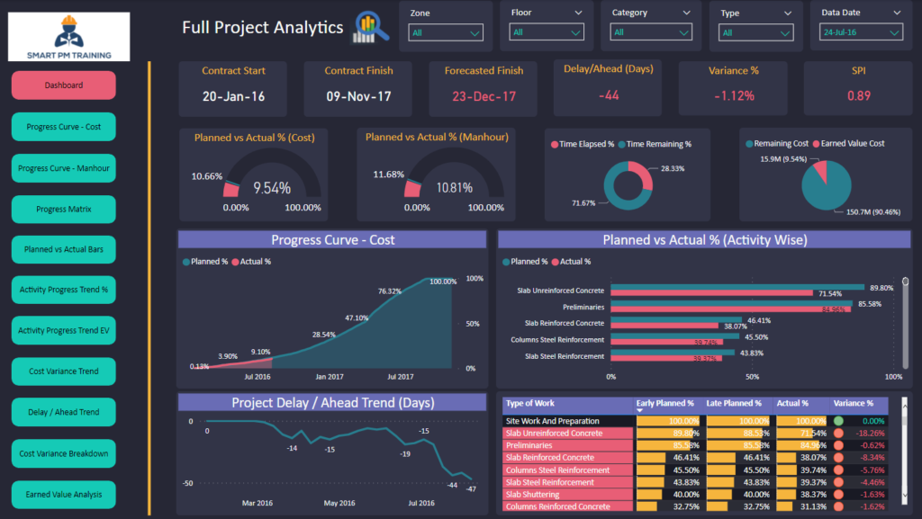
It is a document that reports high-level progress status. It assists project parties and key decision-makers to understand the project performance, current issues and potential risks. A dashboard is part of a progress report and might include the followings:
- Data Date.
- Contract data (start, completion and duration).
- High-level progress indicators and payment information.
- Status of the schedule milestones.
- High-level QA/QC Performance.
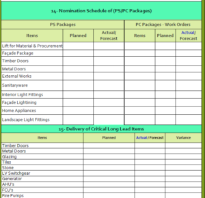
- Nominations Status.
- Project Risks.
- High-level status of payments applications.
The story framework of a progress dashboard
Humans love stories. That’s why we don’t feel bored by a good movie. A dashboard should be developed through a story too. It is not a good practice to show project risks at the beginning of a dashboard; rather it makes more sense to build the dashboard in the below order:
- Contract Data (start, finish and duration)
- Overall project indicators (variance, forecasted finish date)
- Area-wise indicators (e.g. concrete, finishes, etc)
Dashboard Presentation
Some planning Engineers think that the more colours they incorporate into the dashboard, the better but this is not true. I am not asking you to be an artist but basic presentation and formatting skills are required in order to develop a professional dashboard. I will break the presentation part down into two areas which are the colour selection and visual aids.
Colour selection
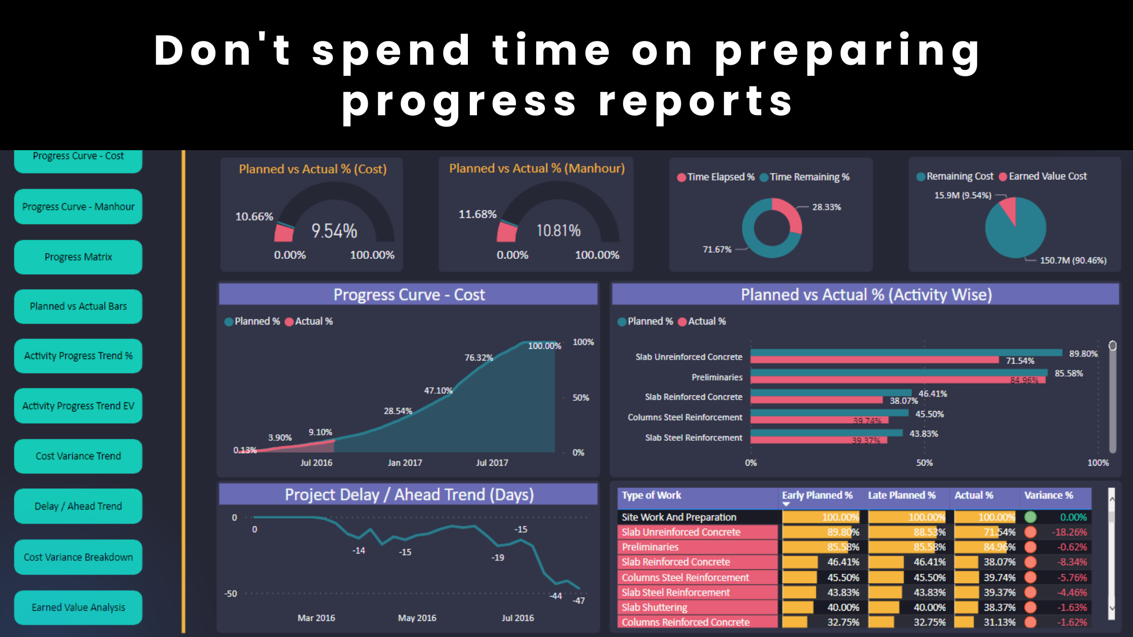
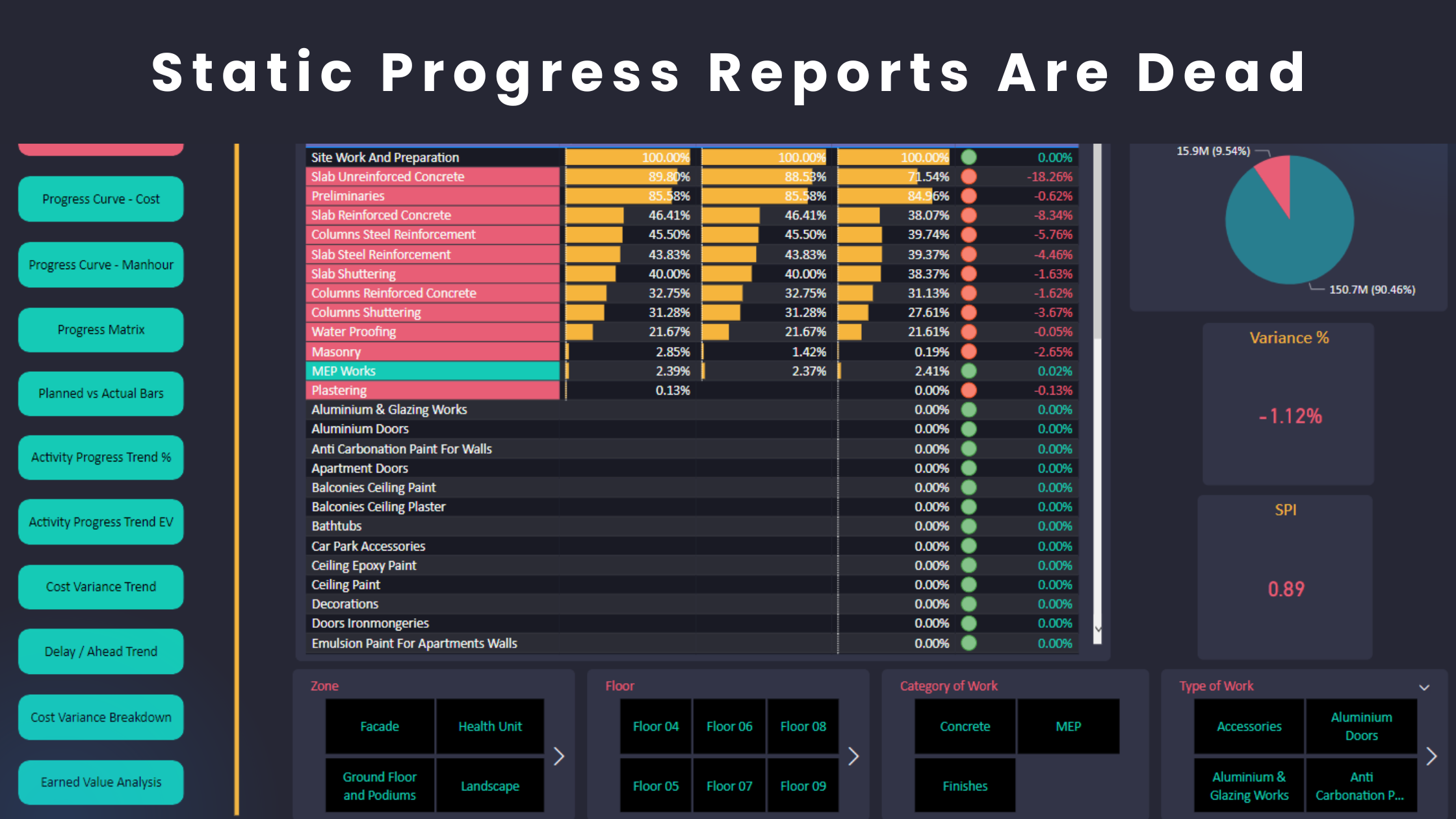
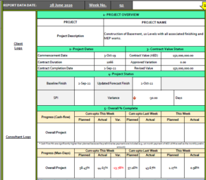
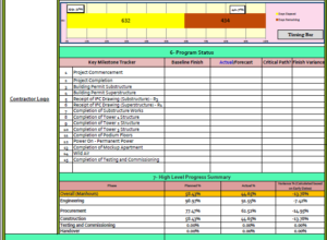
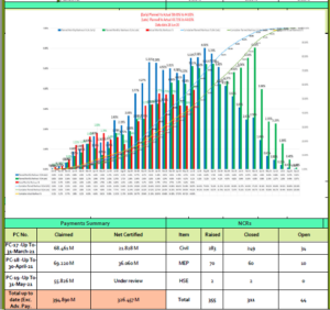
Create themes that have a few colours only and be consistent when you use them. For example, in the below dashboard, the theme has two main colours which are red and green. Moreover, the orange colour is consistently used for the chart titles, while violet is used for the title background. It is also a good idea to use colours that are complementary and tailored for different reporting purposes.

Pro Tip: Search “Adobe Color Wheel” and use it to select colours. If you want to determine the complementary colours for Green, google “green color palette” to know the complementary colours.
Luckily, we have some great tools at our disposal. One of my favourites is Power BI. You can create a theme and set up the colours you want. The theme will be applied to the existing parts of your dashboard and even any future areas that you might want to add later on. This literally saved me several hours of formatting work. Yes, I am a perfectionist but trying not to be. For all perfectionists out there, you will love the theme feature in Power BI.
Visual Aids
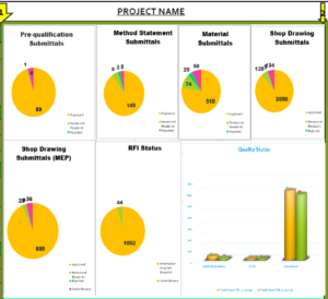
Sometimes less is more. Icons are a great way to deliver your message quickly and effectively. For example, a green arrow that points in the upward direction indicates a positive outcome. It is a good practice to provide a variety of indicators through icons and symbols.
Below you will find snapshots of different sections in a dashboard.
Automation
Projects are costly and complex to manage. Companies invest millions of dollars in project control solutions. The last thing you want to do is to complete your dashboard or prepare your progress report manually because the process will be very time-consuming, and you will likely make mistakes. The solution is to build systems and machines to get all the work done on an autopilot instead of re-inventing the wheel every time you prepare a progress report. You build the machine only once at the beginning of the project. Afterward, you only need to maintain the system, make sure it functions properly and add lubricants to the machine, if needed. Complete your Primavera P6 update and get your report ready in less than 30 seconds. Power BI allows you to do all of that.
Level of details
Many Planning Engineers aim to incorporate as much data as possible into a dashboard. However, as a good practice, you need to show only the high-level status in the key project areas. If a reviewer is interested to learn more about a certain area, he/she can refer the relevant section of the report in order to dive into the details. For example, you shouldn’t show everything about delay analysis in a dashboard but you can show the status of claim submissions. Afterward, the reviewer may wish to refer relevant sections such as Notices of Extension of Time Claims Log to further investigate the causes of delay.
A dashboard is a great way to present the overall progress status. Although there are no universal or standard formats, any dashboard should have both the story framework and the presentation practices as explained above with an automated system in place. Moreover, this document is not meant to show everything in the project.
Learn More!
Check out our comprehensive courses
Regards,
Osama Saad, MBA. PMP, PSP, PMI-SP